
Threw this together last night...
 T3hD4ve
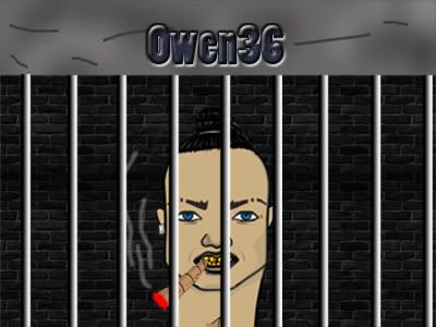
Threw this sig pic together last night in 5 mins when the internet died out on me, been stalling on it since I started here, but finally I had an excuse cos I was working on photoshop anyway.
Whatcha think? C&C is always appreciated, whats good, bad, etc.
 owen36
Hi T3hD4ve i think this is great but im not quite sure if this is a real photo/picture or like a cartoon style but either way its good. I wonder if the name could be a bit clearer but please dont see this as a negative as i couldnt even do this and after 5 mins its absolutly great. I hope this helps
 romz
romzA real "stock" image with one filter.
 T3hD4ve
More or less, trimmed the pic off, colour/contrast tweak, slapped a border round it, played around with text, still didn't look right to me so then came the blue tint & one last minute crosshatch filter.
Tried to use one of my own pics for it (the smoking section at my local bar has a prison yard feel to it with the bars) but the lighting sucked.
And the name being clearer, only realised now that when i resized it, it messed with the text.
Aint actually played around with photoshop in AGES, just use it for work so when I'm done I don't usually wanna sit at it to relax, needa shoot something to do that! But I'm gunna start dabbling again and see what else I can come up with.
BravoI think next time you should show the original picture, and then your edited picture right next to eachother. I think this will show your editing much better.
That picture doesnt really allow text placement very well. Not one spot, that I could say I would look good. Where you have your "T2hD4ve" is probably the best spot. I would however make the color of your font text a color that goes with the rest of the image.
T3hD4veYeah, I should of taken the time to find the right shade of blue/grey for it, but when I get home and get access to the psd file again I'll give it a lil whirl and fire in a link to the original.